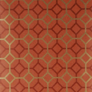
There they are - the powder room suns - waiting, lurking in the dark shadows
peeping out behind the door
Gazing bemused while I wash my hands
And, while I pee, the suns shine down on me - a little judgmentally I feel.
Wallpaper: Il Sole by Cole & Son sold through Lee Jofa
Saturday, April 24, 2010
The Suns Shine Down On Me
Tuesday, February 02, 2010
Gold toned papers
The white tone on tone wallpaper samples that I sent for from Graham and Brown were a bust. The tone on tone Checker looked dingy and the Curvy didn't read at all, its beautiful geometrical swirls simply disappeared on the foyer walls. The black Checker looked better but was still too one note - not the play on shade I had been expecting.
So, if the tone on tone is too boring and the terracotta and gold papers are just too much of a statement what, I wondered, if we went with a less bold color and pattern but a brighter, more metallic hue. Especially, as you can see in the photo above, we have more open spaces than solid walls in the foyer. What do you think?
Luna in Gold/Tan from Cole & Son via Lee Jofa
Muse in Champagne via Lee Jofa
Carlu in Nickel 
or Gold by Designers Guild
Finally - grasscloth is very mid-century modern and it's making a comeback. W3043-24 is a 50% grass/50% paper blend in a real golden tone available from Kravet.
Saturday, January 23, 2010
Black and White
Hanging the House paintings in the foyer has me re-thinking the whole gold on terracotta wallpaper vision. The black frames and stark white mattes are leading me in another direction. I wonder what tone on tone black or white would look like in the space...
This Graham and Brown Checkered pattern via Design Public echoes the geometric shapes in the house without competing for attention. Available in white or black. (I also want the Vitra George Nelson Sunflower clock so bad).
The black flock wallcovering from Romo Laurito in Ebony from the Grandis collection would certainly make a statement. 
Gorgeous but maybe a little too like a snowflake? Marcel Wanders Stella wallpaper from Design Public available in white, black and a range of other colours.
Smudgy and edgy, Carlu Noir from Designers Guild also comes in Vanilla.
Or maybe a modern Anaglypta that we could paint would be the best way to go - we'd get texture while keeping control over colour. Graham & Brown paintable wallpaper in Curvy
Wednesday, January 06, 2010
Golden Walls

Now that we have the furniture back in the Great Room, I asked the Awesome Designer, Julie Napoleon Brown, to bring back this paper, Grasses by Mulberry in Red/Gold to see if it would work for the foyer. Being a star, she also pulled a few more wallpapers in the same colourway. After I had carefully placed them aroud the walls, The Guy glanced around and uttered the fatal words: The trees in the forest paper is looking a lot more appealing! We'll ignore him, though and move on...
My initial favourite: Octavio by Mulberry in Copper/Red
The Guy's favourite (if he were forced to choose): Gilded Fresco in Red/Gold from Mulberry.
The two papers together in situ - maybe my choice is too geometric?
After seeing them all in daylight and by CFL lighting I'm being seduced by this Red/Gold/Rust beauty: Palm Court, Cole & Son, from their Vintage Glamour Collection.
At first I thought it was too Arts and Crafts but in real life it really shines off the wall
as does this sample of Grasses that I started with.
I'm no nearer make a decision, so Interwebs, please weigh in with you thoughts!
All wallcoverings available from Lee Jofa (trade only).
Tuesday, December 08, 2009
Design Day
So you know how you start with one thing, say re-upholstering a distressed pink sofa, and then because you changed the colour you have to pick a new rug and pillow fabric and the next thing you know you've picked a wallpaper for the powder room and you're having a full-on argument with your other half about who has the better design ethics - in front of the professional with the credentials, taste level and portfolio to render any disagreement moot, the Awesome Designer for instance. You know that sort of a day? Well, that was my Monday.
The Awesome Designer, who does have a real name - Julie Napoleon Brown, and whose work you can see here, here and here - was devoting a few hours of her precious, much sought-after design time to take me rug shopping. Somehow that developed into a full-on entire day, including many hours spent pulling fabrics at Kravet's Long Island showroom.
Surprisingly, it was this square Chinese Chippendale carpet that made me gasp: coup de foudre, coup de coeur. It wasn't the colour we were looking for, nor the shape and certainly didn't read updated sixties chic -but it just leapt out at me and straight into my arms. 
The Awesome Designer set to work pulling co-ordinating pillow fabrics like this Barclay Butera Chinese inspired print as well as more retro weaves and blocks of bright blues and greens and terracottas that would marry the cool blue of the sectional with the warm tones of the rug. 
I got so carried away I suggested we look for a kick-ass wallpaper for the powder room and foyer - because you cannot expect that a newly-waxed floor in the great room onto which you've placed a sensual gold and terracotta rug surrounded by a freshly upholstered slate-blue sectional accented with one-of-kind cushions, will distract from the primer-over-wallpaper-base walls in the entrance hall, now can you? It would be more warthog with designer pearls than lipstick on a pig.
We hauled one rug home, plus two bags containing samples for a uniquely-coloured custom rug, fabrics for both options and a dozen or so wallpapers. Then we layed it all out in the great room to see what would work and what wouldn't. When we had it paired down to a cohesive design board we cracked open a bottle of white and awaited the arrival of The Guy who enthusiastically approved the rug and most of the pillow fabrics (including weirdly a zebra print we had put aside as a no-go) and out-right vetoed our paper choice (copper, black, gold and silver elms on a dark background that looks stunning in situ) saying he didn't want to feel like he was walking through a forest every time he went upstairs. Really interwebs, wouldn't you want to trip through the trees on your way to bed?
Anyway, another contender Grasses by Mulberry, and one that I really think would be more like weaving through a forest didn't make the cut either. The Guy's choice -walking through a town - is obviously not going to happen. We brought over The Loyal Blog Reader to mediate - but he wisely refused to get involved. Right now were are at an impasse on the foyer but, concentrating on the positive, we have a rug and pillow fabrics and the sectional will be back home next week. And, more importantly, I had a "girl in a sweet-shop" sort of day shopping with the best and most patient designer around.
Thursday, April 23, 2009
Wallflowers
Look at all the pretty flowers, not decals but 3D representations. For all styles and all budgets:

High end designer decor from Amy Lau for Kip's Bay House 2009 via pointclickhome.com. This photo really doesn't do the installation justice. Visit wallcovering firm Maya Romanoff to appreciate the achievement of Amy Lau and paper artist, Jo Lynn Alcorn or tour the townhouse now until Sunday, May 17th.

Malin Lundmark painted steel Flower Hooks. $58 for three @ Abitare

Wallflower Wall Decor from Umbra. Available in pink, kiwi, white, and black $37 per set of 25 magnet mounted polypropylene flowers.
This post was written as part of the Hooked on Houses blog fest. Julia is having a Grey Gardens obsession today. Grey Gardens is in the Hamptons on the south shore of Long Island, right at the other end of Suffolk County from Beach House but it's all Long Island, all the time.. I'm also upcycling it to Fifi Flowers Design Decor because it's the eco-friendly thing to do this week AND because she's drinking champagne in Champagne, France.
Monday, June 16, 2008
Uniquely modern wallpaper

Flying saucers, flat-head whales and bucking broncos on this fabulous and fantastic Barok'n'roll wallpaper from WallCollection. Designed by artist and skateboarder Emil Kozak in black on white, white on black or white on red, it's a neat twist on a classic Baroque wall covering. All the usual ornamental flourishes are, in fact, tiny details: here a diamond, there a skull, over there a heart. Once you start looking you'll spend hours examining the paper.
WallCollection are a Danish company but you can buy their products throughout Europe and the US, too. Their product differs from traditional wallpaper in that it is digitally printed allowing for a more flexibility in design, a larger color palette, no pattern repeat and no wastage. The added bonus for those of us who want something unique - you can upload your own photo to their website and they'll create your custom wallpaper. The feature also allows you to price the wallpaper out and see what it looks like before you decide to purchase. Just measure the height and width of the wall you want to decorate (in centimeters, please) and use the online calculator to do the hard work for you. As a rough guide n 8'high 10' long wall will run somewhere between $700 and $1500 depending whether you use on of their designs or one of your own.
Monday, December 03, 2007
Wowser wallpaper

What do you think of this Fracto wallpaper from Umbra? I love it in rust and want to put it in the foyer.
It's only $39 a roll and we wouldn't need many for this space, it's also super easy to hang, even for the novice. It says so right on the website.
My only concerns are that it might be a little dark and it has to co-ordinate with the rooms that are open to the foyer: the den, dining room and great room, and they all have a lot of crimson accents. And there's the kitchen too, because even though there's a door there, we never close it.
Friday, November 02, 2007
Do months have colours?
They do in my twisted mind. November has always seemed like a grey month and in that spirit I decided to paint the downstairs powder room a steely grey. The problem is that there are so many shades out there, even if I confine it to Benjamin Moore colors. Another Shade of Grey even has links to gray paints on her website. I was wary of making it too dark because it's a tiny space, I don't like greys with lavender undertones and I thought the blue-toned greys might not go with the faux marble vanity top (I can't wait to replace that baby with the real thing). So in the end I used Benjamin Moore Titanium, a grey with a greenish hue. It's the same paint I put on the dining room walls. And when I say same paint, I mean the half gallon we had left over from that project. I know it says to use the paint within six months but it won't be the first time I've let paint sit for a couple of years before throwing it on the walls, and we have already established I am a cheap lady. It isn't really steely but it looks stylish enough.
The best thing about painting this house is the surprise I always get when I take off the heating grills. The original Las Vegas on Acid 1968 wallpaper will be revealed in a tantalising 8"x6" strip. The half-bath did not disappoint: grey foil wallpaper with black squiggles and beige blotches. Groovy.
And it's a good thing I didn't start this project in October - because that screams pumpkin orange.
Edited to add: I went back into the powder room after the walls dried and the are a great colour. Unfortunately the clean walls clashed with the filthy beige carpet. So I ripped it out. The plan is to redo that floor when we do the kitchen floor, which is looking further and further away and I am definitely not living with a disgusting carpet or with carpet tacks for the next year or two. Sooooo a solution will have to be found pronto.
At least it's Friday and we have all weekend to think of something.
Friday, October 12, 2007
Funky, stylish and fun
I knew I should have left that wallpaper alone when we moved in. Even though it had fused to the wall where water had leaked through the windows, and there were damp patches from the water penetration from the roof it was typical 60s paper. And guess what? All of a sudden wallpaper is back and it's fabulous.
I really want to put one 60s inspired kick-ass wallpaper somewhere in the house and I think the foyer is crying out for this one, appropriately called Party Girl, in red. Or maybe this ferm Living Feather wallpaper in a rich teal colour.
Either way, I'm going to have to wait until the master bath is renovated and all its leaks fixed, it would be heartbreaking to put it up and then find dripping bath water had fused it to the wall.
Monday, June 12, 2006
More colour
Before putting the house on the market the listing agent made previous owner have the entire house repainted Navajo White. We know that the house was originally painted a bright blue in the dining room and den. The bedrooms were originally funky late 60s oil blue, gold, green and yellow, and pink and purple. We discovered that early on because the painters didn't bother painting the insides of the closets. The mud room, maid's room (now my office) and the hallway and stairs were once wallpapered. We have found some of the original wallpaper behind light switches and when we replaced the thermostat in the foyer. I wish I could have seen the house in all its original glory. 
Apart from the Bronzed Beige customised walls, we have decorated the dining room, which we painted with Benjamin Moore Titanium on the walls and Cloud White on the ceiling and baseboards and the master suite with Ralph Lauren Blue Mesa. I also mixed Cabot Wood stains in Ebony and Walnut to get the colour I wanted on the replacement windows. I have touched up around the new windows in the den, Verity's and Fliss' rooms with the Navajo White. Although Navajo White is really not our style I'm not planning to paint there any time soon because the paint is new. The kitchen and foyer have only primer so far, and while it's bright, it's kind of boring, but there doesn't seem much point in painting until the kitchen project gets underway. I'm getting impatient here, can you tell?
Monday, June 05, 2006
Personalizing those custom colors
Checking on my site visitors with StatCounter this morning, I was fascinated to find someone had linked through a Google search on "Bronzed Beige" the Benjamin Moore paint color. I posted a year or so ago that I had bought two gallons of the paint the previous November (2004) and had yet to slap it on the walls. I never did post what happened to them.
Apparently you are supposed to toss paint you haven't used after six months but I abhor waste so that didn't happen. Last October I did open one can, stirred it really well and slapped a coat on the mud room wall that had previously had the wallpaper that looked like mold. Unfortunately on the wall the paint looked like mold too, sandy mold but not something I could live with. I decided something a little brighter would be better and bought a can of BM Yellow Highlighter and mixed a pint of that with a pint of the Bronzed Beige. It was too yellow for the mud room but worked really well on my office walls. I made up another batch of the mix, but this time 75% Bronzed Beige and 25% Yellow Highlighter and used that on the mud room. It's better but eventually I'll repaint it, probably when we do the kitchen. The kitchen project seems to be turning into an entire first floor decorating project!
The remaining gallon or so of Bronzed Beige I mixed with two gallons of Super White and painted the fern bedroom and, after a brief flirtation with an accent wall in Ravishing Red and a replacement from our local dealer who had given me Red Oxide by mistake, Steven's office, too.
Four rooms, three different shades from a couple of gallons of oops paint can't be bad. Of course I still have a gallon of Ravishing Red I need to find a use for before it hardens in the can.


