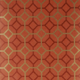
The Cool House: decor
Showing posts with label decor. Show all posts

Monday, April 16, 2012

April to April

The last twelve months have flown by, hardly time to post to the blog what with all the twitter twaddle and facebook folies to constantly update. I knew this would happen, I'm basically lazy so if I can say it in 140 characters or less that's the option I'll take, thank you very much. But on the warmest day of a warm April that succeeded the hottest March ever, preceded by a no-Winter that meant no snow and no photos of 2" icicles hanging from the garage roof (and therefore no threat of decapitation when dragging the trash cans down the drive), I've had time to reflect on the past year. 
Firstly, that Spring-like Winter has meant everything in the garden is blooming a good three weeks ahead of normal. This was last April 16 - in past Aprils we've still been salting the back drive this time of year.


The same view today, the forsythia is over, the hostas are up and the azaleas out. It's also 87F and not raining so big bonus, there!


I even pruned the forsythia the was obscuring the pink azalea but not without a minor oops moment.


What was the tenet about bringing the outdoors in... or making lemonade out of lemons?

The early blossoming Spring holds true for the magnolias, too.


Last year May 5.


This year April 8

Secondly the house is looking more put together, even if all the major renovations finished way back in 2010. A lot has to do with the new placement of art and the way we are using the space. The eat-in section of the kitchen is a spot where we spend a lot of time now we are free to laptop/iphone/tablet roam with wifi, often it seems we don't even bother visiting our offices, we just sit at the breakfast table and do our respective things. Sometimes, though I clear up and it's quite serene


Thirdly, I am still nuts. On one of the hottest August days last summer I swapped the rugs in the den and dining room. On my own because The Guy flatly refused to indulge my crazy one more time.


The orange rug headed back to the den


and the cream rug was dragged into the great room. It felt so good I bought it a couple of new cushions in a mid-century inspired pattern in the sale at Crate&Barrel. It's so much lighter in there that I'm sitting there typing. The newly fixed sliding doors are open and I'm listening to what sounds like a duck in the yard. I'm expecting the fox will appear again tonight. April to April... plus ça change, plus c'est la même chose!

Tuesday, April 12, 2011

The den: A study in black and brown


I've posted nothing about this room since the sneak peek of the rug last year. I'm still on the fence about that, it's warm and soft which makes it a kind of kitty heaven but that leads to clawing and fur balls so we may end up putting it in Verity's room but for now it stays.


It isn't a completely finished room yet, we'll replace the last huge single glazed window at some point, add some bookshelves or corner cabinets. maybe a game table under the chandelier and give the walls a coat of paint but for now it's a liveable, cosy space.


This is how it used to look before I suffered a renovation breakdown and got rid of the raised dais and built in cabinets.


The northwest side: I ended up placing the Probber cube in the corner behind the Eames Lounge chair, mainly so we had enough light to read in the evenings without waiting for the time-delay spots to come on. I have fantasies about a cowhide rug under the chair...


Before: The same angle with original stained carpet.

Thursday, December 30, 2010

Green Guest Bedroom


New roman blinds and pillows brought to life by The Awesome Designer.


Arts and crafts inspired, uniquely modern Robert Allen fabric - Celtic Knot in a lovely green colourway called Kelp.

Tuesday, December 21, 2010

Black & Grey with a Touch of Pink


Verity's room recived a mini makeoever this fall - new grey hex patterned rug, black and cream drapes and a new pink Tribeca pillow by Designers Guild. I'm still searching for the right duvet cover to replace the Marimekko one so we can call this room done.

Tuesday, September 21, 2010

Inspirational Decor


One of my favorite inspiartion rooms. Black & White Salon from Marie Claire Maison featuring the "Bouquet" chair by designer Yoshioka Tokujin. I love the way all the black elements in this tall room bring your eye down to ground level and that the ethereal quality of the chair is balanced by the weighty ceramic bird. Beautiful.

Tuesday, February 02, 2010

Gold toned papers

The white tone on tone wallpaper samples that I sent for from Graham and Brown were a bust. The tone on tone Checker looked dingy and the Curvy didn't read at all, its beautiful geometrical swirls simply disappeared on the foyer walls. The black Checker looked better but was still too one note - not the play on shade I had been expecting.


So, if the tone on tone is too boring and the terracotta and gold papers are just too much of a statement what, I wondered, if we went with a less bold color and pattern but a brighter, more metallic hue. Especially, as you can see in the photo above, we have more open spaces than solid walls in the foyer. What do you think?


Luna in Gold/Tan from Cole & Son via Lee Jofa


Muse in Champagne via Lee Jofa


Carlu in Nickel


or Gold by Designers Guild


Finally - grasscloth is very mid-century modern and it's making a comeback. W3043-24 is a 50% grass/50% paper blend in a real golden tone available from Kravet.

Saturday, January 23, 2010

Black and White

Hanging the House paintings in the foyer has me re-thinking the whole gold on terracotta wallpaper vision. The black frames and stark white mattes are leading me in another direction. I wonder what tone on tone black or white would look like in the space...


This Graham and Brown Checkered pattern via Design Public echoes the geometric shapes in the house without competing for attention. Available in white or black. (I also want the Vitra George Nelson Sunflower clock so bad).


The black flock wallcovering from Romo Laurito in Ebony from the Grandis collection would certainly make a statement.


Gorgeous but maybe a little too like a snowflake? Marcel Wanders Stella wallpaper from Design Public available in white, black and a range of other colours.


Smudgy and edgy, Carlu Noir from Designers Guild also comes in Vanilla.


Or maybe a modern Anaglypta that we could paint would be the best way to go - we'd get texture while keeping control over colour. Graham & Brown paintable wallpaper in Curvy

Wednesday, January 20, 2010

Houses are Home


Since I brought them back to The Cool House, I've tried Nadine Bouler's House paintings in various locations: the great room, the dining room, the kitchen and my office; in the end I decided they looked best right up front in the foyer. So I moved Will Klemm's Radiant to the great room where the orange and gold pear fits right in with the new rug and placed House in Flight in its place. It looks at home here, the dimensions of the piece fill the wall space better, the colors compliment the architecture.


Then I grouped the other three pieces on the opposite wall. Now visitors to The Cool House can view the work up close and get a preview of the back yard exterior without venturing outside. Perfect... at least I think so - let's see if Nadine approves!

Monday, January 11, 2010

Decor Encore


A couple of accessories made their way into The Cool House recently. Firstly, thanks to kind Patricia who keeps her eye out for Georges Briard pieces, a serving dish with a stunning MCM pattern on the lid


Next from a local Antique dealer at Yankee Peddler this large grey ceramic lamp. A uniquely modern bargain with a very sensual shape. It lacks a shade though and the naked CFL bulb is not doing it for me at all. What do you think - Drum? Oval? Giclee?

Wednesday, January 06, 2010

Golden Walls


Now that we have the furniture back in the Great Room, I asked the Awesome Designer, Julie Napoleon Brown, to bring back this paper, Grasses by Mulberry in Red/Gold to see if it would work for the foyer. Being a star, she also pulled a few more wallpapers in the same colourway. After I had carefully placed them aroud the walls, The Guy glanced around and uttered the fatal words: The trees in the forest paper is looking a lot more appealing! We'll ignore him, though and move on...


My initial favourite: Octavio by Mulberry in Copper/Red


The Guy's favourite (if he were forced to choose): Gilded Fresco in Red/Gold from Mulberry.


The two papers together in situ - maybe my choice is too geometric?


After seeing them all in daylight and by CFL lighting I'm being seduced by this Red/Gold/Rust beauty: Palm Court, Cole & Son, from their Vintage Glamour Collection.


At first I thought it was too Arts and Crafts but in real life it really shines off the wall


as does this sample of Grasses that I started with.
I'm no nearer make a decision, so Interwebs, please weigh in with you thoughts!

All wallcoverings available from Lee Jofa (trade only).

Thursday, May 07, 2009

Refresh Your Stinky Room


Dutch Boy paints introduce Refresh, the first premium quality paint with Arm & Hammer Odor Eliminating Technology and zero VOC.

It's talking a big talk with GREENGUARD Indoor Air Quality and Green Cert certification and the website has a cool interactive video but as my mac doesn't come with sense-o-smell I don't know how well it really works. All I can say is that Sadie the dog had an "accident" a week or so back and even Nature's Miracle couldn't get the smell out. I eventually poured a packet of Arm & Hammer Baking Soda over the stain and left it overnight. Result: Smell completely vanished. If Refresh has the same effect as an open container of baking powder at neutralising odours I would definitely try it. And if Dutch Boy throws in a competition whereby I could win paint AND big bucks, I'm intrigued. What about you?


Here's what you do: Go to My House Stinks and submit a photo of your horrible room (there are a few examples up already so you can see what the competition is like). The winner of the most "annihilated-looking" room wins $5,000 and 50 gallons of Refresh to help rejuvenate their living space! Second prize: $2,500 and 25 gallons of Refresh; 3rd prize: $1,000 and 10 gallons of Refresh! Voters are eligible to win gallons of paint too, when they rate the rooms. Drawings monthly until October 2009.

If you win (or you decide to try the paint anyway) come back here and tell the interwebs what you think. Deal?

Wednesday, May 06, 2009

Coral Trends


Maybe squid is the new coral....

Tuesday, May 05, 2009

Modern Mother's Day Gifts

Did you know that it's almost Mother's Day? A marketing opportunity like no other that is celebrated all around the world (albeit on different days)? Although I don't do Hallmark holidays, it seems everyone else does so here's a few ideas for gifts for Modern Moms.


Exclusive New York emporium Moss has some fab suggestions for the design savvy including Kiln, enamel bowls and platters in half a dozen different colours from designers Elissa Ehlin and James Leritz. They are simple, yet vibrant and modern. Price range $85-$315.


DWR has a fun lamb-shaped bar of soap made of sheep's milk $12, and something I would definitely want as a winter gift: a hot water bottle with an alpaca cover. Snuggly!


From Design Public a really cute and unusual idea: Octopi Cups by design group Cake. In white on black or black on cream, they'd make great toothbrush holders for a stylish bathroom, too. $18 each.

In case you need to know, here's what I would NOT love to receive on Sunday: a homemeade Oreo cake; warmed frozen croissants (especially a year's supply thereof); a personalized entertaining and recipe journal. Avoid here at all costs, you do not want to see my face if you have rush-shipped me their best selling Mother's Day gift: an All-Clad Waffle Maker!

Monday, May 04, 2009

Enameled Copper Dish


I don't usually buy souvenirs when I'm on vacation but I picked up this copper bowl by artist Susan Funes on our trip to Buenos Aires last year. It's unique, modern and fits my decor perfectly. I love the depth and cloud effect of the brown tones that contrasts with the regular criss-cross pattern of the royal blue lines. At the intersection of each line there's a tiny ochre dot - a tiny detail that adds so much to the finished design. Enjoy!

Wednesday, April 29, 2009

Coral is still in?

According to Williams-Sonoma coral is the color of the season.

It's one of my favourite shades so I'll give them a pass but I can spot at least three trends that are passé or at least completely overdone, including the use of faux coral as an accent.
What about you?

Tuesday, April 28, 2009

Inspired by Daffodils

One lone daffodil to be precise. I don't know the variety but the combination of pale sunshine yellow and hot orange makes me want to sing* and decorate with:

A bright orange Arne Jacobsen Egg Chair

Soft saffron Elin bed linens by Area from The Conran Shop 


Finnish designer Sanna Annukka's folklore inspired Kanteleen fabric from Marimekko

Or maybe I should make a couple of DIY art panels with a quart of Benjamin Moore Citrus Orange and another of Lemon Meringue?
What would I be singing? Well, certainly this number from the Belgian days