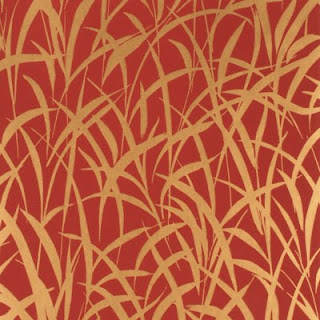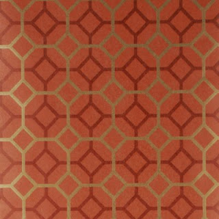
Now that we have the furniture back in the Great Room, I asked the Awesome Designer, Julie Napoleon Brown, to bring back this paper, Grasses by Mulberry in Red/Gold to see if it would work for the foyer. Being a star, she also pulled a few more wallpapers in the same colourway. After I had carefully placed them aroud the walls, The Guy glanced around and uttered the fatal words: The trees in the forest paper is looking a lot more appealing! We'll ignore him, though and move on...
My initial favourite: Octavio by Mulberry in Copper/Red
The Guy's favourite (if he were forced to choose): Gilded Fresco in Red/Gold from Mulberry.
The two papers together in situ - maybe my choice is too geometric?
After seeing them all in daylight and by CFL lighting I'm being seduced by this Red/Gold/Rust beauty: Palm Court, Cole & Son, from their Vintage Glamour Collection.
At first I thought it was too Arts and Crafts but in real life it really shines off the wall
as does this sample of Grasses that I started with.
I'm no nearer make a decision, so Interwebs, please weigh in with you thoughts!
All wallcoverings available from Lee Jofa (trade only).
Wednesday, January 06, 2010
Golden Walls
Labels:
awesome designer,
cool house,
decor,
decorating,
design,
foyer,
wallpaper
Subscribe to:
Post Comments (Atom)


15 comments:
Hmmm...thinking about the "layer" of accessories and artwork, I'd go simple, the one with no pattern to it. Less is more and all that...
I like the grasses... it's gorgeous! But is it too much grass for the room? If so, then I'll side with The Guy Ala Guilded Fresco.
we can always move the accessories... and the art :)
Why are you all siding with The Guy? It'll go to his head!
Just for the record, I did NOT vote for the upholstered bed.
I know this is bad (for the decision-making) but I like Octavio. Sorry! :-)
Put me down for the gilded fresco. I recall that I abstained from the bed vote.
I like the grasses one on one wall and something simple and complementary on the others, whilst getting rid of all furniture and 'stuff'
I'm not siding with The Guy. That one is my least favorite. It's a too little faux finish-y for me. I think I'd choose the Grasses. I liked it in both views. But maybe you give us too much power?
Can you compromise and put the grasses on one wall??
I like octavio on it's own, but I can see how the grassy one might work well in that location... but I really dislike the gilded one, reminds me of a faux painting technique, something that is trying to be something else. honesty in materials.
I think if The Guy wants a gilded fresco look he should talk Nadine into giving him a lesson - that gal can walltreat like a pro!
Susan: I don't have a wall I could use for a feature paper - it's all doorways and stairs!
I am really in love with the grass cloth wallpaper however, the problem with that is it maybe too busy for the room because the color is very rich and metallic. It may be good if you were doing it on one or two walls.. but not all the walls.
If you want to go for something more simple then go grand on accessories I would suggest going with Gilded Fresco in Red/Gold from Mulberry.
You know, octavio is growing on me, esp since the house is geometric, not really arts and crafts.
Post a Comment