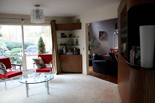
I edged the blue sofa out and replaced it with the crimson Steelcase chairs the Awesome Designer picked up for me. You would not believe how much it lightens up the room.
before
after
The blue sofa is currently taking a break in the empty great room on its way to my office, which will happen as soon as I have taken my Incredible Hulk pills and got some super-strength in my arms and back or when Vez comes for the Holidays, whichever happens first - that thing is dang heavy!
Saturday, December 12, 2009
Quick swap
Friday, December 11, 2009
Tonight: A Taste of Summer to Beat the Winter Chill
Hey! Who's that man and what is he and his friend doing at The Cool House? That's Richie Saccente of Young Rebel Goombas, with fellow Goomba Cosmo Mallardi, drinking coffee at our old kitchen table and getting ready to go out in the pre-remodeled master bedroom. Also starring in this video: the huge pink sectional!
A few things have changed at The Cool House since this was filmed but the music stays the same - tropical rock, filmed in the heat of a Long Island summer, to cheer up this freezing December day.
Download the free mp3 here and pass it on to your friends. Enjoy!
Tuesday, December 08, 2009
Design Day
So you know how you start with one thing, say re-upholstering a distressed pink sofa, and then because you changed the colour you have to pick a new rug and pillow fabric and the next thing you know you've picked a wallpaper for the powder room and you're having a full-on argument with your other half about who has the better design ethics - in front of the professional with the credentials, taste level and portfolio to render any disagreement moot, the Awesome Designer for instance. You know that sort of a day? Well, that was my Monday.
The Awesome Designer, who does have a real name - Julie Napoleon Brown, and whose work you can see here, here and here - was devoting a few hours of her precious, much sought-after design time to take me rug shopping. Somehow that developed into a full-on entire day, including many hours spent pulling fabrics at Kravet's Long Island showroom.
Surprisingly, it was this square Chinese Chippendale carpet that made me gasp: coup de foudre, coup de coeur. It wasn't the colour we were looking for, nor the shape and certainly didn't read updated sixties chic -but it just leapt out at me and straight into my arms. 
The Awesome Designer set to work pulling co-ordinating pillow fabrics like this Barclay Butera Chinese inspired print as well as more retro weaves and blocks of bright blues and greens and terracottas that would marry the cool blue of the sectional with the warm tones of the rug. 
I got so carried away I suggested we look for a kick-ass wallpaper for the powder room and foyer - because you cannot expect that a newly-waxed floor in the great room onto which you've placed a sensual gold and terracotta rug surrounded by a freshly upholstered slate-blue sectional accented with one-of-kind cushions, will distract from the primer-over-wallpaper-base walls in the entrance hall, now can you? It would be more warthog with designer pearls than lipstick on a pig.
We hauled one rug home, plus two bags containing samples for a uniquely-coloured custom rug, fabrics for both options and a dozen or so wallpapers. Then we layed it all out in the great room to see what would work and what wouldn't. When we had it paired down to a cohesive design board we cracked open a bottle of white and awaited the arrival of The Guy who enthusiastically approved the rug and most of the pillow fabrics (including weirdly a zebra print we had put aside as a no-go) and out-right vetoed our paper choice (copper, black, gold and silver elms on a dark background that looks stunning in situ) saying he didn't want to feel like he was walking through a forest every time he went upstairs. Really interwebs, wouldn't you want to trip through the trees on your way to bed?
Anyway, another contender Grasses by Mulberry, and one that I really think would be more like weaving through a forest didn't make the cut either. The Guy's choice -walking through a town - is obviously not going to happen. We brought over The Loyal Blog Reader to mediate - but he wisely refused to get involved. Right now were are at an impasse on the foyer but, concentrating on the positive, we have a rug and pillow fabrics and the sectional will be back home next week. And, more importantly, I had a "girl in a sweet-shop" sort of day shopping with the best and most patient designer around.
Sunday, December 06, 2009
Window Shopping (Weekend Edition)
Brussels: Rue Blaes, Roberto Barr Papier Mache sculptures
Brussels: Sablon, Anne-Claire Petit knitted toys
Bonus: The artist at work in his atelier - Roberto Barr, 41 rue Blaes, Brussels
Saturday, December 05, 2009
Ripe Art
Big art, small art, insects and of course, houses at Nadine Bouler's show, part of the current exhibition at Ripe Art Gallery.
Part of the House series - just prior to the red stickers going up.
House in Flight
Some of the Big Girls
The Alphahouse series
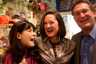
Despite the appalling weather the room was packed: The Loyal Blog Reader, the Artist, The Guy and the Awesome Designer in front of some of the House series of paintings
the Gallery owner and artist, Cherie Via met up with some old friends.
It's an awesome collection; besides Nadine's beautiful and haunting work, Triple Deuce Jewels was showing some rocking silver jewelry; there were ceramics and felted scarves and some fetching blue and pink Pet Semen globes that invited closer inspection. In fact I'm going to go back mid-week for a second viewing. The show runs from today until the end of December. Unfortunately after today you might not see Nadine's fabulous vintage dress but you should go anyway:
Ripe Art Gallery
67 Broadway
Greenlawn, NY 11740-1302
(631) 239-1805
Friday, December 04, 2009
Window Shopping (Brussels)
All these wonderful antique/junk stores are on Rue Blaes, which runs from the Sablon (chi-chi) to the Marolles (traditionally the downtrodden part of Brussels). You can find everything you ever searched for and a lot you didn't know you wanted: art nouveau to art deco; MCM, retro and space age chic; made to measure furniture to custom leather handbags; old school chairs and even a working carousel!
There is a light
... that never comes on. The light on the refrigerator side of the alarmingly expensive Sub-Zero 690 that is - the freezer is lit so I can check the vodka is ok and I know the fridge is cold but I have no idea how cold because THE LIGHT SWITCH IS NOT WORKING. I had the condenser replaced in the summer, the water dispenser re-fitted, twice, when we first got it in 2004; I am not a happy bunny.
A gem from their website "Sub-Zero and Wolf appliances are built to exacting standards..." Yep, that's exactly the adjective I would have chosen! Oh, and have I mentioned that every summer when it gets hot (like EVERY summer in New York) the ice maker stops working and you have to reset the system? Every summer. It's become something of a joke, except that it's not funny.
A guy is coming today to fix it. He's been before, doubtless he will come again. As they say on their website: Your relationship with Sub-Zero and Wolf doesn’t end the second your appliances are installed. In fact, we hope that’s just the beginning of a long relationship.
To keep my sanity (and my temper) I'm singing this song with slightly altered lyrics. Enjoy!
Tuesday, December 01, 2009
Paris (and Brussels): 5 Days, 500 shots
I was amazed when I uploaded the photos of the Thanksgiving weekend trip to Paris and BXL to find out I'd taken 167 shots on the iPhone and 333 on my fantastic Canon EOS Rebel. After I'd removed the accidently taken shots of my shoes I was left with a round 500 images of the two European capitals. Some of them I've posted via my twitter account and a lot more will go up on flickr over the next few days but here - just for the flavour, so to speak - is un petit tour...
Paris: Mademoiselles in the Jardin des Tuileries
Paris: "Big Girls" in Montmartre
Paris: Job Opportunities
Paris: From Pont de l'Alma to the Basilique du Sacré-Cœur
Brussels: Plaisirs d'hiver/Winter Pret - real genever or Peket
Brussels: surreality à pied
and finally....
Brussels: The Guy tries to comprehend the city's Xmas Decorations
Monday, November 30, 2009
Tuesday, November 24, 2009
Shall we dance?
The pink sectional has gone and we have gained a beautiful waxed parquet floor
Notice the difference from the left side (where the sectional was sitting) to the right - or high traffic area. The unused side has a beautiful rich polish on it which I will redo while the big beast goes from pink to blue.
And while we have this big empty space we can send out the rug for cleaning, move the tables aside and have a sliding competition across the length of the floor... or dance and swirl around to this tune from the master on the wall, M. Jacques Brel
Sunday, November 22, 2009
46 yards of fabric
Say good-bye to the big pink sectional. The 12-piece Harvey Probber-designed 1968 chair and ottoman combination that is original to the house is about to get a huge, fabulous makeover. Jacques Brel up there recently got re-framed and has been looking down his nose ever since at the tufts of batting hanging from the torn upholstered corners. 
Finally the Awesome Designer decided she I couldn't live with the scratched up, spilt, holey mess it had become and kicked my butt offered to find a suitable fabric and re-upholster it back to its original glory. Over the course of a few weeks she bought me swatches - many, many swatches. She hunted all over the Island and into the City for the right fabric. We started with twenty or so contenders in browns and beiges, pinks, greens and blues - even a plaid
and soon there were more - many, many more - bags of chenilles, stripes and damasks in hundreds of hues. We narrowed down the palette to a range of blues and greens from pewter to denim to seafoam, and the pattern to a simple solid. I asked twitter and facebook pals to vote for their favourite, which helped narrow it down to four front-runners.
There was one fabric, a heavy-duty woven chenille, from the new range of fabrics by Kravet, the Kravetsmart that I loved above all others; it just felt right - soft but really hard-wearing. It's teflon-coated 102,000 double rubs so it should be bullet (or cat) proof.
I had to wait to see all the blue toned swatches but the end I chose the colour I'd always had in mind - a steely-blue that compliments the warm tones of the wood floors, ceiling and beams and the soft shade of the sandstone wall and echoes the bluestone fireplace and patio outside.
And now the fabric- all 46 yards - has arrived, the sectional is awaiting collection and the renovation will soon be underway. In a few weeks I'll be able to reveal the newly upholstered seating area... I can't wait!
By Land or By Sea*... with the help of a glass of Pinot Noir
A couple of creative bloggers and their significant others joined The Guy and me on an international voyage with an American twist at CREW Kitchen* in Huntington Harbor (Halesite) last night. An evening of hilarity and great food with a glass or two of wine (and beer) ensued, followed by a quick trip to Holland and the Scottish Isles back at The Cool House. I didn't take my camera with me (bad, bad blogger) so you'll have to rely on the photo essays of the Fabulous Graphic Designer and the Amazing Artist and Author for the fully illustrated version. Did we have a good time? Today I'm making restorative Chicken Soup while my liver has a chance to recover, so yes I think it was simply splendid evening...
*Five course tasting menu - choice of all meat or all fish, or do what the renegades do and mix and match; there's also a wine flight pairing. As always, the staff are super-accommodating - and the crab balls come highly recommended!
*Decor at CREW by the Awesome Designer, Julie Napoleon Brown
Friday, November 20, 2009
The big bed bust or the super kitchen table steal deal
The DWR Annexe sale in Secaucus last weekend had plenty of bargains - there were lots of King-sized beds on sale, including the Matera that I loved, and all these tables that I've previously considered to replace our cafe kitchen table were substantially reduced. Not that we were looking for tables on Saturday but we were there and they were there, so...
This oval Saarinen had a black marble (Nero) top, too dark for our house - and we decided too big
This round Saarinen had the white Carrera top but it was the same size as the present kitchen table - too small
I was leaning towards the Matthew Hilton Cross table but it was only available in bleached oak - too light
The Warren Platner table that I didn't even consider because The Guy had vetoed it a few years back. The same Guy who called me across the room as I was checking the beds out. He had his whole hand on it and I think he would have licked the top if anyone other than a salesperson had come near him. He wasn't going to give it up. What could I say? It's the right period (1966), right shape, unique, classic, eco-friendly (Greenguard Indoor Air Quality Certified) and Warren Platner worked with Raymond Loewy just as Andrew Geller had done. Bonus - it has exactly the right dimensions for the kitchen. SOLD!
Thursday, November 19, 2009
Flat caps
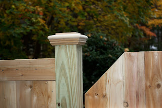
The fence is finally up, all the blue plastic chicken wire has been removed and the old gate has a new set of hardware with self-closing latches. Dogs are securely on one side and the landscapers/pool guys/tree people don't have to lean on it to ensure it latches properly. Polly is, I think, a little sad that she can't get out on her own to go and greet the neighbors but I'm relieved. More importantly no small child can get into the backyard unaided.
The minor niggles - design issues really - like having to put in three different heights, 4', 5' and 6' on the west, east, and south sides, and three different styles so they'd tie into existing fence panels, have worked out better in the practical application than I could ever imagine. It helps that the grade rises by a foot in places so the panels are stepped anyway; we're also fortunate you can't see the whole fence from any vantage point either because of all the plantings.
In fact on the east and south sides you can see very little of the fence itself, just the flat caps I chose to top each post. Those things are fiendishly expensive but as The Guy says: The devil is in the design details.


