The Cool House

Thursday, May 28, 2009

Hues, Tints and Shades


I've been pondering the difficulty in defining a color, an issue I illustrated while trending pink and chartreuse.

There is, of course, the dictionary definition:
   "color refers to the wavelength composition of light, shade is a gradation of color referring to its degree of darkness, tint is a gradation referring to its degree of lightness, and hue indicates a modification of a basic color... hue is the quality of a color that makes it possible to call it bluish green, etc. (the color of a color); shade is a color variation having to do with the value of a hue (lightness or darkness), and tint is a pale variation of a color". 
But that lacks the necessary visual clarity.

Now, thanks to a link from VSL, you can take the Munsell Hue Test and arrange colors in hue order to determine your color I.Q.
I scored 33, which while not bad is far from perfect. You?

Wednesday, May 27, 2009

Luminous Landscapes


Sag Harbor artist April Gornik's exhibition at the Heckscher Museum of Art in Huntington presents twelve huge canvases, including Suspended Sky (2004) (above) that blur the boundaries between representation and imagination to produce works of mystery, luminosity and power.

In this collection paintings inspired by trips to the Caribbean, China, and Namibia are shown alongside landscapes of New Mexico and Long Island. In each piece Gornik plays with the juxtaposition of light, in the form of water, moon/sunlight or a lightening strike and dark weight: rocks, sand dunes, pounding seas or a threatening sky, contrasting calm and menace in a way that provokes an almost physical reaction to each painting.

From Turning Waterfall (1997), where the viewer seems to be enveloped by a swirling cascade of silken water, pinned on either side by foreboding rock walls, to Mirror Lake, China (2004), where we gaze from the side of the lake upon an ethereal hazy landscape, the sun only a reflection in the water, we are compelled to be engaged in her landscapes.

The Luminous Landscapes of April Gornik runs through July 5, 2009. In conjunction with the show, Heckscher Museum's Voices and Visions series will feature a lecture/gallery talk with the artist on June 18 at 7pm. Admission to the talk $5.

Tuesday, May 26, 2009

Check List: Monday PM


bees: hunted


weeds: pulled


beach: walked


weekend: complete

Monday, May 25, 2009

Weekend Achievements...

Monday AM edition:


pots of purple basil and oregano added to herb garden


Tomatoes, peppers, basil, lemon balm and cilantro in the jumbo container by the barbecue


Third attempt at setting the stone (if this doesn't work we'll be calling in the mason)!

Still to do this afternoon:


more weeding needed


and it's time for the annual carpenter bee hunt. Those guys will be going down. Spotted four so far, two dead (from the white powder I dusted in the holes last month) and two bent on making the siding into a holey mess.

Certain traditional Memorial Day activities will not be happening:


The pool is covered with a layer of pollen and only 73 degrees. Brr

Sunday, May 24, 2009

So far...

the weekend has had...


a little of this


a limited amount of that


one of these...


and a lot of...

Saturday, May 23, 2009

Craftsman Modern


If I had the need for a bar stool, which I do not, if I even liked bar stools, which, unless they are in a bar, I really don't and if I had $1,400 in the budget, which is never going to happen, this warm, handcrafted, uniquely modern Tractor Bar Stool is the one I would buy.

Designed by BassamFellows as part of their Craftsman Modern collection I love everything about it: the ergonomic solid walnut seat, inspired by a Swiss tractor seat; the leather wrapped footrest; the mid-century feel of the tapered legs. I want to look at every day; to touch it; to sit it on it, elbow resting on the counter, one foot resting gently on that leather bar.


Despite the seductiveness of the image I just painted, practically I have no use for a bar stool but fortunately The Tractor Stool also comes in a regular height model ($1350). That would be better suited to our needs; it's just the thing to add to the table when extra guests turn up unexpectedly and would look gorgeous in The Cool House, or any modern, or Craftsman, interior.

The Craftsman Modern Collection, which includes tables, credenzas and a deceptively simple daybed, is available from The Conran Shop. You can see more of BassamFellows' furniture in a New York Times slideshow of their Philip Johnson designed house.

Friday, May 22, 2009

Trending Pink

OK I'll be honest, I have a sort of pink obsession going on. Maybe I'm influenced by all the azaleas and rhododendrons flowering in the yard right now... but they've bloomed every Spring since we've lived here so there must be more to it than that.


For instance, I've never been tempted to put five shades of shocking pink in one planter before. I'm a minimalist and that would normally drive me crazy.


Maybe it's the really vibrant shades of pink Geberas and Impatiens that the local nursery had on display


Or maybe it was From the Right Bank to the Left Coast who blogged this Radiant Pink sink. A pop of fun pink in an otherwise white space that I'm seriously considering for our kitchen renovation. It would bring a rosy glow into my kitchen every time the sun shone and would do wonders for my skin tone. But I'm a fickle sort... What if I tired of the pink in a year or two?


Luckily there is be a way to get a fuchsia fix without permanent commitment. Danish design group Bodum are bringing colour to their kitchenware this summer - cafetieres and toasters in green, purple, red and pink! They're also introducing this ergonomic Gravity Spice Grinder $29.95. You can enter to win one from PointclickHome here.


Deep, Hot, Hollywood Pink - it's coming close to replacing Chartreuse as my current color of choice. But no matter how enthralled by pink I may become there's still one place I won't go.

There must be something in the air because Fifi Flowers is drinking Pink, while Hooked on houses is swinging on the porch.

Thursday, May 21, 2009

Babu the Boar Bookend


Love Babu the cute limited edition leather boar bookend by Zuny. Also available: adorable Lion, woolly Sheep and black and white Dinosaur, at Generate $49 each

Monday, May 18, 2009

The weekend: Highs and Lows

A quick round-up of the weekend:


Highlights: Dinner with Mme Faboolosity and Hubby in the old 'hood, followed by Jill Sobule concert at The Landmark on Main Street. Spent evening coveting Jill's red velvet wedges.


Sunset on the deck in Huntington Bay, appetizers for dinner. (Cell service at the beach!)


Taking photos of the yard followed by best BBQ spare ribs and black beans ever.


Lows: First ever failed fairy cakes. I took this as a personal insult! (N.B. Failure does not mean inedible. There are only four left and I don't eat cake...)
Not fun yard work: weeding, removing thorny suckers and sucky vines; pruning the dead twigs from azalea bushes
Thousands of tiny caterpillars discovered the day after weeding - all over clothes, bedroom floor, bathroom. (The Guy had said the previous evening he thought ants were crawling over him and the zyrtec he took hadn't helped...)


Hitting head on outside lamp while taking close ups of planter... two of the three bulbs are no longer working but I have lump the size of lightbulb where I smacked it...

Sunday, May 17, 2009

Variations of Pink

Today's post is brought to you by the colour PINK.


Who knew (apart from artists, graphic designers and webmasters) that there were so many shades of pink? More hues or tones than I can name, each pinker than the last...


After a couple of days shooting the azaleas I was seeing pink.


Salmon pink?


 Ballerina slipper pink?


Cerise?  


Hollywood Rose?


Then the rhododendrons began to open. Pale pink...


Lavender pink. Lavender rose?


And deep pink... Fuchsia, Magenta?


Or a combination of pinks - hot and cool


The flowering azalea hedge, a riotous display of... Tea Rose? Persian Rose? Maybe just Rose?

I love this time of year when the yard blooms with a hundred or more variations on the colour pink.

Saturday, May 16, 2009

Red and Gold*

Gorgeous red peony in my neighbor's yard (mine are smaller, later, pink and white). Ruby coloured crimped petals with a garland of gold - perfectly understated elegance.
Speaking of which this is most definitely not!

*OR: The Peony and the PCV

Thursday, May 14, 2009

Chartreuse


It's still officially Spring so I'm going to forgo Nature's burst into bloom* and let myself be seduced again by green, or more precisely, chartreuse. A mix of yellow and green, chartreuse is bright and peppy almost like the new growth on the weeping juniper tree.


The difficulty is finding a shot that will truly reflect the color on the screen. In the yard these hostas are edged with a perfect chartreuse. On the mac? Not so much.


Chartreuse is elusive -  at first glance it's everywhere but through the camera lens the lime-tinged conifers outside the kitchen window are just pale green.


This shrub held promise but the yellow turns out to be insipid not inspirational; wishy-washy, or simply washed-out.


It's a colour that's hard to define exactly; the paint chips lean to more muddy yellow hues while the hex designation on the web is an equal mix of yellow and green that results in an acid tone. I was so obsessed with Chartreuse that when we painted the kitchen I tried many variations on the kitchen walls from Anjou Pear to Sweet Pear and every chartreuse inspired pea shade in between. Sadly none of them replicated the color that I find in my yard... or the one in my imagination.

 
Perhaps the problem is that chartreuse is such a saturated hue it needs a contrasting colour to set it off- a smoky blue or a stone grey,


a soft silver green or a bluey-purple?


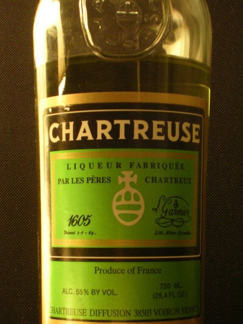
Why the fascination with chartreuse, apart from the mellifluous sound of the word itself? Because, every so often I'm reminded that once in my sophisticated youth there was a fondness for liqueurs. I was a Benedictine girl but my drinking companion loved Chartreuse and asked for one in a country pub atop a lonely hillock in the wilds of Cumbria. She got what she deserved. The bartender laconically replied: We ain't got no green but we got som o' that yella. Our faux urbanity dissolved in a fit of giggles and henceforth "som o' that yella" was used to describe any delightful but possibly pretentious and overpriced item.


Not at all like the gorgeous chartreuse green of the new leaves on this azalea or the flecks of colour inside the white blossoms.

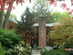
*(I fibbed because I couldn't leave you without one shot of the yard in bloom).