The Cool House

Saturday, May 16, 2009

Red and Gold*

Gorgeous red peony in my neighbor's yard (mine are smaller, later, pink and white). Ruby coloured crimped petals with a garland of gold - perfectly understated elegance.
Speaking of which this is most definitely not!

*OR: The Peony and the PCV

Thursday, May 14, 2009

Chartreuse


It's still officially Spring so I'm going to forgo Nature's burst into bloom* and let myself be seduced again by green, or more precisely, chartreuse. A mix of yellow and green, chartreuse is bright and peppy almost like the new growth on the weeping juniper tree.


The difficulty is finding a shot that will truly reflect the color on the screen. In the yard these hostas are edged with a perfect chartreuse. On the mac? Not so much.


Chartreuse is elusive -  at first glance it's everywhere but through the camera lens the lime-tinged conifers outside the kitchen window are just pale green.


This shrub held promise but the yellow turns out to be insipid not inspirational; wishy-washy, or simply washed-out.


It's a colour that's hard to define exactly; the paint chips lean to more muddy yellow hues while the hex designation on the web is an equal mix of yellow and green that results in an acid tone. I was so obsessed with Chartreuse that when we painted the kitchen I tried many variations on the kitchen walls from Anjou Pear to Sweet Pear and every chartreuse inspired pea shade in between. Sadly none of them replicated the color that I find in my yard... or the one in my imagination.

 
Perhaps the problem is that chartreuse is such a saturated hue it needs a contrasting colour to set it off- a smoky blue or a stone grey,


a soft silver green or a bluey-purple?


Why the fascination with chartreuse, apart from the mellifluous sound of the word itself? Because, every so often I'm reminded that once in my sophisticated youth there was a fondness for liqueurs. I was a Benedictine girl but my drinking companion loved Chartreuse and asked for one in a country pub atop a lonely hillock in the wilds of Cumbria. She got what she deserved. The bartender laconically replied: We ain't got no green but we got som o' that yella. Our faux urbanity dissolved in a fit of giggles and henceforth "som o' that yella" was used to describe any delightful but possibly pretentious and overpriced item.


Not at all like the gorgeous chartreuse green of the new leaves on this azalea or the flecks of colour inside the white blossoms.

*(I fibbed because I couldn't leave you without one shot of the yard in bloom).

Monday, May 11, 2009

Green Beach House


The first full day of summer 2009 is the date homeowner Jill Kornman has set to be lounging on the porch of her newly-built green beach house. The determination she shows to finish construction in the next six weeks is a tribute to her vision, the design plan of architects Bouler Design Group and the skill and dedication of her team of builders.


Situated on a strip of land where the Atlantic Ocean meets Long Island's Great South Bay, the house with its geo-thermal heat pump, solar panels, extra insulation, and use of green building materials, is a premier example of sustainable architecture. I've been following its progress since I first heard that BDG was building a modern house with a zero carbon footprint in Oak Beach, NY. I was lucky enough to be invited by Creative Advisor Nadine Bouler (seen here on the right with Jill on the left) to see the house at 90% complete.


BDG worked with the owner to create an energy-efficient beach house that fits the scale of the surrounding properties on this barrier beach. Although the house has a unique design, traces of the original cottage can still be seen in the north side of the building - in the remains of the screened-in porch, the arches and of course the ubiquitous shingles.


Superimposed upon the original footprint are two soaring towers. One of these, with its tapered walls and clerestory windows, gives the playroom/library/zen retreat (the purpose hasn't yet been finalised) the feel of a monastery within and a lighthouse outside - and superb views of the bay to the south, east and west.


Facing south the angled roofs are covered in EPDM, a non-polluting synthetic rubber roof that will support enough solar panels to provide for all the electrical needs of the 2000 sq ft house. Naturally the design of the house takes full advantage of the beautiful site. Huge sliding glass doors with transoms above allow 180 degree views of the ocean to the south, while to the east a wall of windows will flood the house with light at sunrise. But Jill goes that extra mile: mindful of the aesthetics of the building and the surrounding shore, she is having the power lines seen in this photo re-routed underground.


Although most of the finishes are chosen: polished concrete floors with inset stone though out the house; reclaimed white oak treads on the staircase and bamboo on the barrel ceiling in the living room, some have yet to be finalized, including the kitchen cabinets and guest bath. All are sustainable, but perhaps the best examples of environmentally-friendly fixtures are the banister posts made from reclaimed pilings.


Jill has been hands-on throughout the process. She interviewed several architects before finding one she believed truly shared her dream of building green and she's been able to keep a close watch on the construction, renting the house next door while her dream house is built. She chose BDG because they believe in efficient design; building smarter, not necessarily bigger, houses. For more information on the Oak Beach house and other sustainable designs visit the Bouler Design Group website.

Sunday, May 10, 2009

Polish and dust (then polish some more)

The day started and ended with shoe polishing. There are no pictures of this because, frankly, photos of shoe cleaning are worse than photos of paint drying. But I will say that it's The Guy who undertakes this chore and there's a whole process involved: several rags, "real polish", brushes. perhaps a little spit to help things along and always, always, complaints about the choice of colour to match the shoes. I'm much more a buff it up sort of girl so I walk away as soon as he gets the polish out. But if you feel you need know more about the polishing process here's a condensed version.


An hour or so later the shoes shone and we could move on to the next chore: Masonry Part Deux.


One of the stones The Guy carefully re-set a few weekends ago popped again. When we lifted it this time it separated cleanly along a natural fault, leaving a thicker piece that we were able to reset and a thinner piece we'll keep and use to replace cracked stones on other projects.


We used a different grade of stone dust for the mortar that should be more resistant to cracking. It looks much more natural than last time so we're hopeful. (The reddish coloured line in the photo above isn't a crack but hæmatite within the stone).


But why were there two shoe cleaning episodes? Hmm. Someone undertook the messy, dusty work in his Cole Haan sandals....


.... and had to clean them quickly before another pair became "yard shoes". 
(Yes, I fibbed about the no shoe-polishing photo).

Saturday, May 09, 2009

House Voyeur

Yesterday's voyeur tour was so popular I'm feeding your habit again. More Incorporated Village Housevoyeurism here:

Friday, May 08, 2009

Hooked on (Victorian Beach) Houses

Everyone knows I'm a modern girl, it's right there in the URL after all, but that's not to say I don't have flirtations with older architecture. I've even lived in a Victorian house - real Victorian that is, built during the reign of Queen Victoria (1837-1901), not Victorian-style - and I still love the elegance of the older ladies.

Within the Incorporated Village there are outstanding examples of late Victorian and early C20th architecture; so many that the Bay Crest area has earned a place on the National Register of Historic Places.

I love the shingle style "beach cottages"


their porches

 
rooflines


and turrets


The windows,


 especially the windows


the beautiful original stucco gatehouses


and the glimpses of grandeur long past.

This post is part of Hooked on Houses Friday blog fest

Thursday, May 07, 2009

Beach Walk

Yesterday was a lazy day.  
The kind of day when taking the time 
to walk on the beach with someone 
could lead to discoveries 
mundane and marvelous. 
 
Finding beauty in the remains of a pier 


or a gushing drainpipe

 
sea life
 
and shells 
 
ospreys soaring over the pond
 
ending with the promise of summer

Refresh Your Stinky Room


Dutch Boy paints introduce Refresh, the first premium quality paint with Arm & Hammer Odor Eliminating Technology and zero VOC.

It's talking a big talk with GREENGUARD Indoor Air Quality and Green Cert certification and the website has a cool interactive video but as my mac doesn't come with sense-o-smell I don't know how well it really works. All I can say is that Sadie the dog had an "accident" a week or so back and even Nature's Miracle couldn't get the smell out. I eventually poured a packet of Arm & Hammer Baking Soda over the stain and left it overnight. Result: Smell completely vanished. If Refresh has the same effect as an open container of baking powder at neutralising odours I would definitely try it. And if Dutch Boy throws in a competition whereby I could win paint AND big bucks, I'm intrigued. What about you?


Here's what you do: Go to My House Stinks and submit a photo of your horrible room (there are a few examples up already so you can see what the competition is like). The winner of the most "annihilated-looking" room wins $5,000 and 50 gallons of Refresh to help rejuvenate their living space! Second prize: $2,500 and 25 gallons of Refresh; 3rd prize: $1,000 and 10 gallons of Refresh! Voters are eligible to win gallons of paint too, when they rate the rooms. Drawings monthly until October 2009.

If you win (or you decide to try the paint anyway) come back here and tell the interwebs what you think. Deal?

Wednesday, May 06, 2009

Coral Trends


Maybe squid is the new coral....

Tuesday, May 05, 2009

Modern Mother's Day Gifts

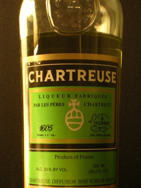
Did you know that it's almost Mother's Day? A marketing opportunity like no other that is celebrated all around the world (albeit on different days)? Although I don't do Hallmark holidays, it seems everyone else does so here's a few ideas for gifts for Modern Moms.


Exclusive New York emporium Moss has some fab suggestions for the design savvy including Kiln, enamel bowls and platters in half a dozen different colours from designers Elissa Ehlin and James Leritz. They are simple, yet vibrant and modern. Price range $85-$315.


DWR has a fun lamb-shaped bar of soap made of sheep's milk $12, and something I would definitely want as a winter gift: a hot water bottle with an alpaca cover. Snuggly!


From Design Public a really cute and unusual idea: Octopi Cups by design group Cake. In white on black or black on cream, they'd make great toothbrush holders for a stylish bathroom, too. $18 each.

In case you need to know, here's what I would NOT love to receive on Sunday: a homemeade Oreo cake; warmed frozen croissants (especially a year's supply thereof); a personalized entertaining and recipe journal. Avoid here at all costs, you do not want to see my face if you have rush-shipped me their best selling Mother's Day gift: an All-Clad Waffle Maker!

Monday, May 04, 2009

Enameled Copper Dish


I don't usually buy souvenirs when I'm on vacation but I picked up this copper bowl by artist Susan Funes on our trip to Buenos Aires last year. It's unique, modern and fits my decor perfectly. I love the depth and cloud effect of the brown tones that contrasts with the regular criss-cross pattern of the royal blue lines. At the intersection of each line there's a tiny ochre dot - a tiny detail that adds so much to the finished design. Enjoy!

Sunday, May 03, 2009

Cool House Art: Don Clausen

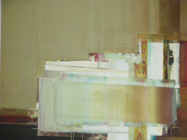
If you're a regular at this site you know I like to give art to mark special occasions. My reasoning is simple: it's a unique gift choice - even if it's a print, or an edition, I'll choose a frame that nobody else will have - but more importantly art is something everybody can enjoy everyday.


For our second anniversary in The Cool House I wanted to get The Guy a painting to hang on the sandstone wall in the great room. It had to be large enough for the space, abstract, have some sort of significance to our lives and of course, I had to know we'd both love it.


It took a while but eventually I found a large oil on canvas by Californian artist Don Clausen entitled Abstract (1984) at a California auction house.


I was immediately drawn to the colour of the painting, the touches of rose pink and aqua amongst the browns and ochre but it's the sculptural quality of the paint on the canvas that keeps me looking at the painting every day and finding something unique each time; even though Abstract (1984) is composed of geometric shapes there's a sense of movement in it that makes it feel alive. We loved it so much I hunted for more and a couple of years later I found a much earlier (1966) painting, Blue Bird, that now hangs on The Guy's office wall.

Don Clausen has been producing great art including pen and ink drawings, sculptures and assemblages for more than fifty years and he's still working. His most recent exhibition at the Alta Galleria in Berkeley features his latest series Tak, Danish for "Thank you", inspired by artists and musicians like Stan Getz, Salvador Dali and Erik Satie. We were very disappointed to miss last year's retrospective celebrating 50 years of work but on our wishlist of future trips is a stay in northern California and a visit to a gallery to see more of his magnificent paintings.

Saturday, May 02, 2009

Valentino, the movie

photo Acolyte Films
Part Sun King, part Roman Emperor, Valentino Garavini was the titular head of his company for forty-five years.  While relying on others to take care of the commercial side of the business, he built a billion dollar enterprise and designed gowns worn by the rich and famous throughout the world, blurring the edges between art and fashion.

Valentino: The Last Emperor is a riveting look at the Italian fashion designer's last year at the eponymous couture house that culminated in Rome in July 2007 with the magnificent Red Party - a retrospective of the his career at Ara Pacis Museum, a ball at the Villa Borghese and dinner for 900 of his closest friends at the Temple of Venus.
Matt Tyrnauer and his film crew had unlimited access to Valentino at a time of crisis when investment funds were taking over the business and rumours of Valentino's iminent retirement were rife. The documentary is a compelling and affectionate portrait of the last true couturier and fashion icon:


Valentino was incapable of designing an ugly dress

He had an entourage and staff of beautiful people, without whom he would probably have stayed in his room all day sketching


photo Acolyte Films
He has a posse of the best trained pugs in the world (pugs know to get off the red carpet when nature calls)

photo Acolyte Films
His seamstresses, who hand sew every garment, are more detail oriented and stressed out than the designer himself

photo Acolyte Films
His almost fifty year business and personal partnership with Giancarlo Giammetti is one of the great love stories. Almost never apart, they bicker constantly, yet love and respect each other completely.


 Valentino made dresses that I covet; possibly this one most of all.