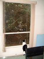
Houseblogs.net, the community for those obsessed with home improvement, is running feature stories this month on four topics, one of which is the dining room. We loved the dining room when we first saw the house, it was large, lofty and had a great beamed ceiling but it was beige - beige ceiling, beige walls, beige carpet and beige vertical blinds. I could have lived with the beige while we tackled more urgent projects but when the previous owner removed her furniture she left behind those bright blue patches on the walls. A tad unsightly, no?
The off-white walls had grey grime where they met the ceiling. For a long time I worried that this was where the roof leaked but it proved to be just where dust from the heating system settled. There was a matching line around the edges of the carpet.
Not attractive, but at least it wasn't a major structural problem. Apart from this the room was dark because the rhododendrons and pine trees outside the windows totally blocked out the light,
and the dusty, vinyl vertical blinds had to go.
We hung framed museum prints we had from our last house over the blue rectangles and had the electrician rewire and hang our 1970s Tre Ci Luce Cesare Lacca "Alien" pendant lamp that we had lugged from Belgium. It had spent the last four years in a box because we didn't have a space in the last place for it but it goes perfectly here.

For three months we couldn't see out of the window
But eventually we chopped back the shrubbery elevating the light levels a gazillion times.
Originally I wanted a sand color on the walls and we pinned up lines of swatches from Benjamin Moore but nothing spoke to us. We progressed to buying try-out pots of paint in golds and shades of café au lait but they all seemed to make the room dingy. I'd been avoiding the greys because I didn't want the dining room to be cold or sad but when I came across Titanium I knew we had a winner. Titanium is such a bright modern-sounding word, isn't it? When we slapped the Titanium over 1968 beach blue it just looked right.
The Guy gave that wall two coats, I touched it up, and touched up the Navajo white on the adjoining walls as far as I could reach. We couldn't paint the rest of the room without buying a long ladder, and we didn't trust ourselves to paint the ceiling without dripping on the beams. We ended up living with this odd colour combination for over a year.

Meanwhile I had a "Eureka!" moment when we took out the built-ins from the boys' bedrooms.

I cannibalized the desk parts to make a new cabinet for the dining room.
Then I went to the local stone fabricator and had tops cut to fit in Carrara marble.
This worked so well we got over-confident and ordered a second top for the cabinet in the den. Unfortunately we failed to measure this accurately so we had a 4' piece of marble hanging around doing nothing. A few weeks of searching and we found this wrought iron wine table in Crate and Barrel that fitted perfectly. It's taller than the console so it's not too matchy-matchy.

The room was coming together but we knew that we had to replace the windows before long so we held off doing more.
In 2005 we put in new windows and I spent a couple of weekends getting the stain right on the frames. The first go at getting window coverings for the room was a bust. We ordered red dupioni silk roman shades from Smith & Noble but they came in with white splodges on the crimson.

We now had curtain rods but nothing to hang on them. While we searched we had the room professionally painted using the Titanium on the walls and BM Cloud White on the ceiling and baseboard. So much better than buying a ladder or scaffolding and they did a great job. In the end the wall with the prints on got a total of five coats of Titanium (two by Steven, one by me because I wasn't happy with his brushmanship, and two by the painters) and the other walls just got two coats.
In the end I found an even better solution than the roman shades, drapery panels in red silk, darker with an almost invisible pattern that gave a depth to the drapes. Even better, these were on sale at Pottery Barn.com and cost less for 6 panels than one of the wrought iron rods we had had to pay full price for at the Pottery Barn store.

Last year I found a great painting on ebay and had it framed at a local store. After some discussion we hung it in the dining room because we loved the way the colours in the painting complemented the grey, white and red of the room.
Three years after we started we consider this room "done". Well almost. Home improvement is never really finished, is it? At some point we want to change the carpet but that will have to wait until we are certain about the plans for the den and the kitchen floors.
Right now we have a dining room that we love, great colours, great light and warm enough to eat in even in winter.
Wednesday, November 14, 2007
Dining Room Update
Subscribe to:
Post Comments (Atom)


2 comments:
Huh... who doesn't move their furniture to PAINT?
It looks really nice! I love the molding.
Post a Comment